

Beyond the Basic Table: Your First Steps in Report Building
Once you've completed the critical planning phase we discussed in the previous post, it's time to roll up your sleeves and build your report. When you first create a Salesforce report, you'll start with the default format: a table report.
In its most basic form, a table report displays each record as a row, with your selected fields appearing as columns. Think of it as a spreadsheet within Salesforce—each contact, donation, or volunteer hour appears as a separate line item with all the details you've chosen to display.
What makes Salesforce reports more powerful than a simple spreadsheet or list view is their ability to display connected records in a single row. For example, you can see a contact's name, email, and phone number alongside details of their most recent donation—all in one clean row.
But the real magic happens when you start using the grouping function.
The Transformative Power of Grouping
If I had to identify the single most important feature that turns basic reports into powerful analytical tools, it would be grouping. This simple yet powerful function is the gateway to meaningful data analysis and visualization in Salesforce.
What Exactly Is Grouping?
Grouping takes a field you select and organizes all records that share the same value for that field. For example:
- Group by State/Province, and all contacts from California appear together
- Group by Donation Date (by month), and all January donations are grouped, then February, and so on
- Group by Campaign Source, and all donors from your spring appeal appear in one section
This organization immediately makes your reports more readable by reducing repetition. Instead of seeing "California" listed 50 times for 50 different contacts, you see "California" once with all relevant contacts nested underneath.
How to Add Grouping to Your Reports
Adding a group is straightforward:
- Search for a field in the grouping section and add it
- Or drag an existing field from the columns section to the grouping section

When you add a field as a grouping, it remains visible in your report but now organizes all related records together.
From Data Display to Data Analysis
Where grouping truly shines is in its ability to transform your report from a simple data display into a powerful analytical tool.
The Magic of Summarizing Numeric Fields
When you group records, Salesforce automatically gives you summarization options for any numeric fields in your report. With just a couple of clicks, you can:
- Sum total donation amounts by month
- Calculate average volunteer hours by program
- Count the number of event attendees by location
- Find minimum and maximum gift amounts by campaign
Let's look at a concrete example:
Scenario: You want to analyze volunteer engagement patterns throughout the year.
The Basic Approach:
- Create a report showing volunteer activities
- Add the Hours field as a column
- Add the Activity Date field as a grouping
- Click on the arrow next the Activity Date and choose to group by Calendar Month
- Click on the Hours column and select "Sum" as the summarization
Just like that, you've transformed a list of individual volunteer activities into a monthly summary of total volunteer hours. You can immediately see which months have the highest and lowest volunteer engagement. And if you don’t need to see the individual contact details you can toggle off the "Show Details" function and you’ll be left with just the total calculations.
Taking It Further with Multiple Groupings
Salesforce allows you to add up to three groupings, which creates nested levels of analysis. These groupings work from top to bottom, with each subsequent grouping nested within the one above it.
Using our volunteer example:
- First grouping: Date (by Month)
- Second grouping: Location
- Third grouping: Program Type
This structure would show you:
- Total volunteer hours per month
- Further broken down by location within each month
- Then further broken down by program type within each location
With this three-level grouping, you could quickly identify patterns like "Our downtown location sees the highest volunteer participation in summer months, particularly in our youth education programs."
From Reports to Visualizations
Once you've added at least one grouping to your report, the door to visualization opens. The graph components in Salesforce use your groupings as the foundation for charts:
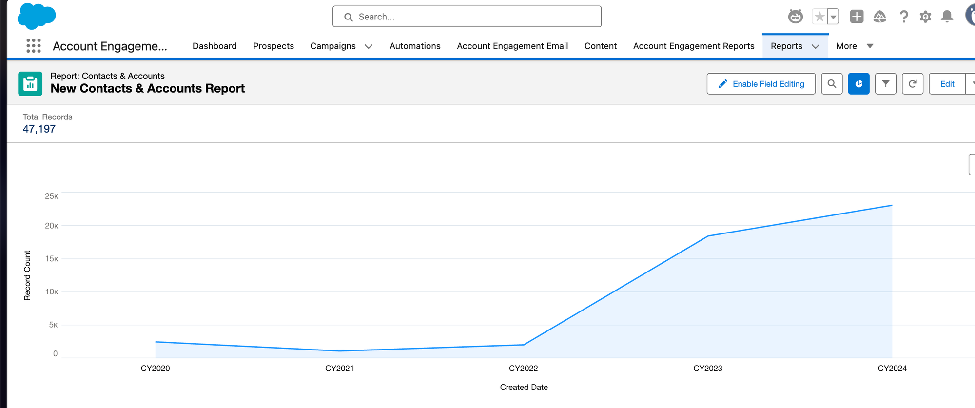
- Your first grouping typically becomes the X-axis (horizontal) of your chart
- The summarized numeric field becomes the Y-axis (vertical)
- Additional groupings can be represented by different colored segments within each bar, line or section
This is why you can't create a graph component without at least one grouping—the grouping provides the categorical structure needed for meaningful visualization.
Date Grouping: A Special Case Worth Mastering
One of the most useful grouping fields is Date. When you group by a date field, Salesforce offers flexible options for how to organize the timeline:
- By day
- By week
- By month
- By quarter
- By year
- By fiscal period
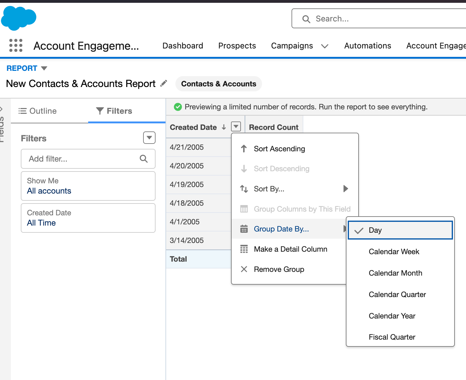
This flexibility allows you to zoom in or out on time-based patterns to match your analytical needs.
For nonprofits, this is particularly valuable for:
- Identifying seasonal donation patterns
- Tracking program participation trends
- Measuring year-over-year growth
- Analyzing fiscal period performance
Real-World Application: Volunteer Analysis Dashboard
Let's put all these concepts together in a realistic scenario:
Your volunteer coordinator needs a dashboard to understand volunteer engagement patterns. With grouped reports, you could create:
Report 1: Monthly Volunteer Hours
- Group by Activity Date (Month)
- Summarize Hours (Sum)
- Create a column chart showing hours by month
- Result: Clear visualization of busy and slow months
Report 2: Location Performance
- Group by Activity Date (Month)
- Second grouping by Location
- Summarize Hours (Sum)
- Create a stacked bar chart
- Result: Shows not just monthly totals but how each location contributes
Report 3: Volunteer Retention
- Group by Volunteer (Name)
- Summarize Activities (Count)
- Filter for date range (current year)
- Result: Identifies your most active volunteers
With these three simple grouped reports, your volunteer coordinator gains powerful insights into program performance without needing to manipulate data in external tools.
Next Steps: Practice Makes Perfect
Why I encourage people get hands on with reports is that there is no fear in messing up something within the database. You aren’t creating anything that changes the data within your organization. You are only looking at the data from different perspectives. So if you incorrectly create the wrong type of report you can delete it with no repercussions. If you are experimenting always work from a new report so you aren’t changing reports created by others.
As you practice, you'll quickly develop an intuition for how grouping can transform your data into meaningful insights.
In our next post, we'll explore more advanced report features like cross-filters, bucketing, and custom summary formulas—but mastering the fundamental skill of grouping is your essential first step to Salesforce reporting excellence.


